App Navigation & Home Screen
One of the key elements to making your app yours and fit your organization’s needs is to configure the way your users navigate the app and what screen they initially see, or will see after logging in.
Authentication
Before we talk about how to customize your apps navigation it’s important to first set the appropriate authentication process for your app.
By default, all apps require a user to register and log in to use your app. You will be able to see who has registered for your app by navigating to “Users” in the Devless Admin. You can also disable users from that screen. Note, the account you use to sign into the Devless Admin will not work for your own app, you also need to register as a user of your app before you can sign into it.
If you have upgraded to a business account, you can also set your app so that it is public and does not require a login at all. You change this by going to “Settings” within the Devless Admin. If you have upgraded to Enterprise, you can also have a login that is restricted to specific email domains, such as your company’s domain by enabling the Advanced Login add-on.
Navigation
Resources & Folders
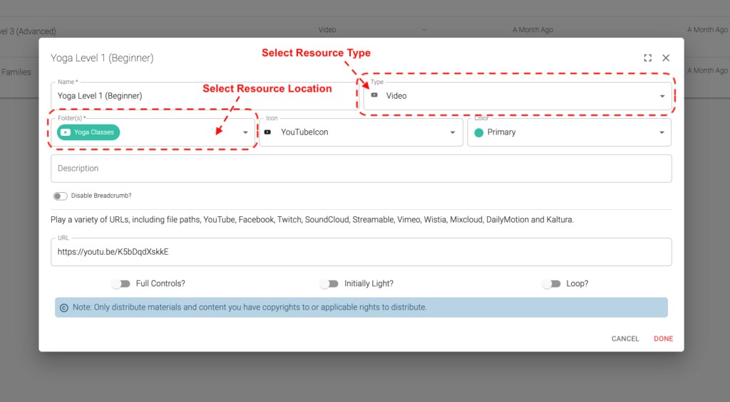
Your app is made up of a series of resources, and those resources can be grouped into folders. The types of resources you can make with the core version of Devless are:
- Article: The default type, this is a basic page of content. This can contain rich text.
- PDF: Embeds a PDF in your app.
- Image: Either allows your users to open this image, or upload images that will be used in other resources.
- File Download: Allows your users to download resources like special content or files. Bonus content or support material, for example.
- Video: Embed a video in your app. Tutorials, bonus content, or podcasts are examples. Videos from YouTube, Vimeo, Twitch, and many others are supported.
- Contact: Add a contact screen to your app. This can be used by some other addon/resources or can be used to provide your users with contact information. Contacts can be people, organizations, or locations.
- Web URL: Either a button that opens a URL or embedded web page. Make sure the site you embed is configured (such as with the X-Frame-Options header) to allow it to be embedded from the domain you select for your app.
Note that you can place each resource in multiple folders. By default, these folders are also how your users will navigate to those resources. However, there are a number of ways you can customize this.
If these core resources do not meet your needs, there are a number of add-ons that will expand this list of resources allowing you to tailor your app to your specific needs. Examples are the Guided Support add-on which adds interactive guides to your app, or the Calkie™ add-on which allows you to add AI-driven modules to your app. To see a full list of the add-ons available to you, simply navigate to “Add-ons” in the Devless Admin.
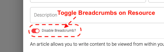
Resource Breadcrumbs
By default, your resources will have a breadcrumb at the top which will allow your users to see how they navigated to this resource and to be able to return to a previous view. However, this may not be intuitive or appropriate for your resources. One of the easiest ways to customize your user’s navigation experience is to disable this. You can do this by simply opening the resource within the Devless Admin, and switching off the “Breadcrumb” option:
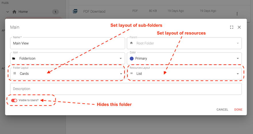
Folder Layout & Visibility
You can create as many folders as you like. Folders often serve as simple a way to group and manage resources but can also affect the user’s navigation through the app, depending on your settings.
First, you can choose how any sub-folder or resources will be displayed when the user views this folder. For both, our options are:
- Grid: The subfolders and/or resources will be laid out in a grid pattern on the screen. This creates a clean evenly spaced layout that is easy for your users to interact with.
- List: The subfolders and/or resources will be laid out as a list on the screen, creating a more condensed view. This is great if there are a lot of subfolders or resources in this location.
- Cards: The subfolders and/or resources will be laid out as “cards” on the screen, making them larger and easier to see the tiles.
- Hidden: The subfolders and/or resources in this folder will not be displayed to the users.
You can also opt for a specific folder to be hidden from users by toggling the “Visible to Users?” option. Note, that this does not necessarily hide the resources in this folder, or it’s subfolders, from things like the site search.
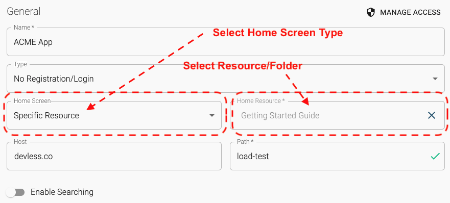
Home Screen
What would you like your users to see when they initially open your app or after logging in? Do you want them to get your app’s primary resource, like a calculator tool or an interactive guide? Or should they see a grid of options so they can select which resource or tool they want to view? There are many options on how you can configure your app’s Home Screen:
- App Root: This is the default settings and will just start the user at the root of your app, giving them a list of the folders in the app’s root to select from.
- Specific Resource: Allows you to select a specific resource to be the home view of the app. This can be used if there is a single resource, like a guide or calculators, which is at the core of the app and where you want users to go right away.
- Specific Folder: Allows you to select a folder to serve as your apps home view, where it would list all of its resources or sub-folders for the user to select from. You can configure how those resources/folders are displayed by changing the folder layouts.